I’ve long been annoyed by the design of nearly every weather site on the Web. Usually, there’s only about three things I care about: the weather right now, the hourly forecast and the forecast for the next several days.
But almost every site spreads those items across multiple pages and gives me all sorts of stuff that’s irrelevant to me. When I plug in my ZIP code to weather.com, for example, the page that comes back tells me the current temperature, the UV index, the dew point, the pressure and the visibility in miles. Some people may find those useful, but not me.
That page doesn’t have the hourly forecast (which is split among 3 pages for the next 24 hours) or the 10-day forecast (yet another page).
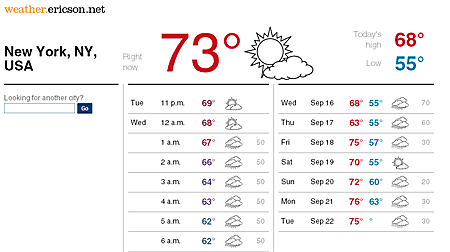
So, I designed a weather Web site just what I want on one page:
Data comes from the National Weather Service via their XML APIs.
Obligatory disclaimers: It’s a big buggy, to say the least. I’m cheating a little bit doing a little interpolation with some of the weather data (tho it should be mostly correct for most locations. I think.) The icons are a bit crude (Anyone want to draw better icons? Drop me an email.) And it may fail rather spectacularly with non-U.S. locations.
The one last feature I want to add: the site always defaults to the last location you search for. Maybe tomorrow …

Matt,
got here via an @flowingdata tweet (thanks Nathan). And thought I might give you some feedback.
Overall, I like the presentation but some things were initially confusing.
– I wondered why the hourly weather needed to scroll so much. It took me a moment to recognize that you are provided more than the current day’s hourly forecast. I’d recommend better demarcation of the different days (or make the days (today, tomorrow, etc) selectable via a simple nav at the top of the hourly box – or maybe only display the next 12 hours (current + 11) with some sort of advancing mechanism. It might also be worthwhile to highlight the current/next hours.
– the separate sections would benefit from titles (Hourly Forecast, Ten Day Forecast)
– I like context with my weather data. In a perfect world, a sparkline of the last 30 days for each forecast and a maybe a bullet chart with MIN, MAX, MEDIAN, and Actual/Forecasted would help tell me something about the weather…
Not a bad solution for your stated problem. Thanks for sharing!
Nice work, Matt. Iconbest has a nice set of free weather icons for non-commercial use.
Hey,
I like your ideas. Nice layout. However, I would like color in the icons. Sometimes I just glance at the weather and it’s nice to see how much orange there is (for the sun). With your interface it’s hard to tell immediately.
Yep, color is on the to-do list.
This is great — nice clean layout. got here via @flowingdata tweet. But I’m confused: what is the gray number at the end of each line? I don’t see any explanation of it.
One thing I find handy on weather charts is a % chance of precipitation. That helps me plan my day — umbrella, shoes, etc. Any chance you intend to add this handy piece of info?
Thanks again — this is really great.
Aaron: The mysterious gray number is just what you’re looking for: the percent chance of precipitation.
Matt,
I found this via @flowingdata tweet, and it is AWESOME.
I notice you’re running WordPress. I’m a WordPress blogger, and would love to be able to create something like this. Any chance you might make it “open source,” or just share it with a WordPress blogger who doesn’t intend to sell it or use it for profit?
If you’d be willing, I’d really like to start with your version and then make some customizations of my own.
Thanks!
Bob
Love this page! It’s my go-to weather page now. One thing I wish is for yesterday’s high/lo, so I can compare whether today is warmer or colder.
THANK YOU!!! I’ve felt the same way abou weather pages. I actually googled “better website than weather.com” and this came up.
I like your current (colored) icons. They are clean and simple.
I agree with Clint: headings over the “Day” “Time” “Temp” etc. that says “Hourly Forecast” and “10-day Forecast” would be helpful — but the design of the layout is so clean and minimalist, I’d hate to see that messed up.
Marking the day changes with added space, would might mess up how the rows line up. So, I’d lean away from that.
But I do find it hard to see when it’s day and night in the chart. Would it be a pain to have 6pm – 6am rows in a gray-shaded background? Or maybe it’d be simpler to just make the background around the weather icons black for the night hours and clear (like they are now) for daylight hours. (I think that’d be sharp.)
Just some thoughts.
Thanks for a great, clean, simple, layout. It’s great!
Pingback: Quora
I discovered weather.ericson.net via flowingdata.com. It’s been my go-to weather site for a few months now. I love it, and the page works well on an iPhone.
I’d love to have it as an iPhone app. I’ve tried a bunch of iPhone weather apps, but simply browsing to you site beats them all. If you made it, I’m sure people would pay for it.
Well done, sir. And much thanks.
Great job! I marked it as a favorite and will visit often. I think you really have something there. How about offering small ads for local advertisers based on location?