Often, when you get data that is organized by geography — say, for example, food stamp rates in every county, high school graduation rates in every state, election results in every House district, racial and ethnic distributions in each census tract — the impulse is since the data CAN be mapped, the best way to present the data MUST be a map. You plug the data into ArcView, join it up with a shapefile, export to Illustrator, clean up the styles and voilà! Instant graphic ready to be published.
And in many cases, that’s the right call.
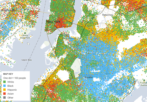
For example, census maps of where whites, blacks, Hispanics and Asians live in New York City show clear geographic patterns, answering questions like “What areas of the city are more segregated?” or “Where is there more diversity?” You can see how Prospect Park is a stark dividing line, with largely white areas west of it, and largely black areas east of it. You can see the how far the Asian population stretches in the area around Chinatown in Lower Manhattan. And you can see the census tracts where there’s greater intermingling of different groups.
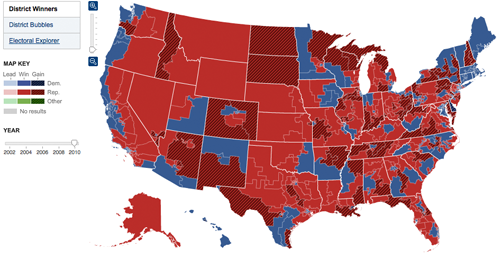
Maps also a terrific way to let readers look up information about specific places. On election night, they answer questions like like “Which seats did the Republicans gain?” or “Who won all the seats in Oregon?” or “Who won my Congressional district?” You don’t have to remember the number of the House district you live in — you can just look at the map, zero in on the area that you’re interested in, and see if it’s shaded red or blue.
And obviously, when the story is completely based on the geography — “How far has the oil spill in the Gulf spread?” — there’s nothing more effective than a map showing just that.
But sometimes the reflexive impulse to map the data can make you forget that showing the data in another form might answer other — and sometimes more important — questions.
So, when should you use a form other than than a map?
1. When the interesting patterns aren’t geographic patterns
On election night, people don’t want to know just “Who’s winning my district?,” but also “Which party is doing better than expected tonight?” And the results map, as good as it is at answering the first question, has a much harder time answering the second.
The most important trends on a House results map don’t correspond to clear geographic patterns. Sure, there’s broad trends in that there are more Democrats in the Northeast and more Republicans in the West. But those differences often pale in comparison to the differences between an urban district, a suburban district and a rural district that are all next to each other in the same state.
One may have been Democratic for years, another may have been held by a long-time Republican but is now up for grabs after a retirement, and the third may be a perpetually close swing seat. But none of that context is visible on the map. So, unless you’re a true political nerd, it’s hard to know whether a splotch of red appearing in a single district in Minnesota is a surprising result or not.
So, when we set out to design our election results package in 2008, we wanted to see if there was an additional way to organize the results to help readers see not just who was winning each seat, but also what was surprising about the results that night.
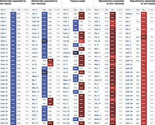
Each election, our reporters handicap the all the Congressional races, classifying them on a five category scale that ranges from Strong Democrat to toss-up to Strong Republican. We use those rankings to organize results on a page that we call the Big Board, which divides the districts into a five-column table based on those categories. The Strong Democratic seats are in a column on the left, the Strong Republican seats are on the right, with the leaning and toss-ups seats in-between. So, as results come in throughout the night, you should expect to see mostly blue on the left, mostly red on the right, and a mix of colors in the middle.
But if you see red creeping onto the left side of the page, or blue onto the right, it’s a visual indication that one party is doing better than expected. If you look at the Big Board from 2010, when Republicans gained control of the House, that’s exactly what you see. There’s no Democratic blue in the rightmost two columns, but you see a number of seats being flipped Republican red on the left side of the page, and twice as much red as blue in the center toss-up column.
And if you take and scroll down the page, about halfway through the states, you’ll see a clear signal of one of the biggest upsets of the night. The single red square popping out of the column of blue Strong Democratic seats indicates the Republican upset in Minn. 8, where Jim Oberstar, a Democrat who had been in the House since the 1970s, was defeated by newcomer Chip Cravaack.
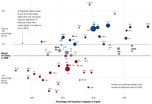
In a similar vein, a graphic by Alicia Parlapiano and Amanda Cox that accompanies an article about how the Obama campaign views the 2012 election map does the same thing, eschewing a map for a visualization form that is a better fit for the story.
The article explains that while the conventional wisdom is that Ohio and other industrial states are the keys to a Democratic presidential victory, the Obama campaign thinks it may be able to win without those if it can capture states like Colorado and Virginia, which have a greater share of educated and higher-income voters.
Normally, the first thought upon hearing of a story about the electoral map is that you should make a map to go with it. (And in this case itself, the story was even slugged “MAP” in our content management system, reinforcing that notion.)
But the reason that the Obama campaign was focusing on those states was not because of their geographic location, which is what a map is most effective at showing, but rather because of their voter demographics. So Alicia and Amanda thought that there should be a better way than a map to show why those states were being targeted.
The result: a scatterplot that compares the percentage of people in the state with college degrees to the margin of victory for Obama or McCain in the last election. The chart clearly shows how those two states are well ahead of others in the education level of their residents, and how the education levels correspond with other states won by Obama and McCain.
2. When the geographic data is more effective for analysis
A second case where it’s more effective to use a form other than a map is when you should be analyzing the geographic data, rather than just displaying it.
After Hurricane Katrina struck New Orleans back in 2005, we produced dozens of graphics in the following weeks and months, including many maps that showed things like how the levee system encircled the city, the extent of the flooding, the demographics of New Orleans and the locations of damaged buildings.
But one of my favorite graphics — or actually, part of a graphic, as you’ll see below — was generated in ArcView, a mapping program, but didn’t actually result in a map.
A couple weeks after the storm struck New Orleans, one of the questions that we wanted to answer was “Who in New Orleans had been most severly affected by the flooding?”
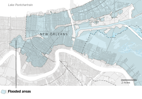
At this point we’d collected a ton of data, including detailed images from the Dartmouth Flood Observatory that showed the areas of the city that were still flooded on Sept. 2, several days after the pumps and levees had failed. Using that image as a base, I traced the flooded areas in ArcMap to create a shapefile that showed the maximum extent of the flooding.
I’d also pulled demographic data from the 2000 Census for every block group in the city, including racial demographics, median household income, poverty rates and educational attainment.
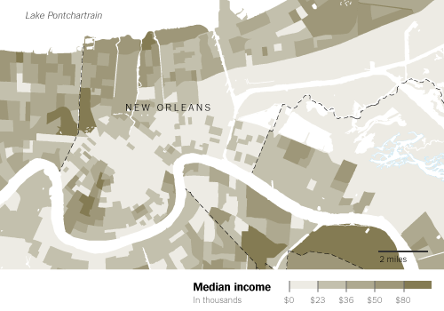
So, at this point, you could take that flood extent and overlay it on different demographic maps to show the characteristics of the flooded areas and the dry areas. Here, the flood extent is overlaid with a map showing the median income in each census block group.
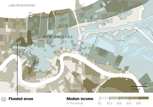
But while maps like that are interesting to look at, it also forces readers who want to figure out the correlation between income and flooding to try and visually sum up all the colors on the map in their head. The map shows there’s low-income areas in the flooded areas and there’s also low-income areas outside the flooded areas. There’s middle- and upper-income areas in each, too. Unless the pattern is super clearcut, trying to figure out how much of a relationship exists is a tricky task.
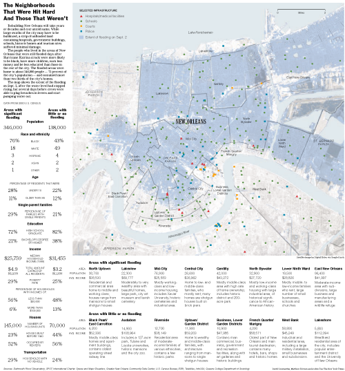
So, instead, I used ArcView to select all the block groups that fell inside the flooded areas and calculate aggregate statistics for the area as a whole. Repeat the process for the block groups that hadn’t been flooded, and you have data for a simple table that clearly and effectively shows the difference between the two areas.
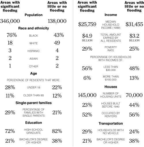
More than twice as many people lived in the significantly flooded areas, and they were more likely to be black, have more children, be less educated and earn less money than those in the rest of the city. There were more families with single parents and they were less likely to own a car. And there were twice as many housing units in the flooded areas, but the homes were newer and more likely to occupied by the homeowner.
In the end, the table ended up getting paired with a large map of the city that showed the flooded areas and the locations of police stations, schools, hospitals and courthouses, and described the neighborhoods in the city.
But while the table was a much smaller portion of the graphic in terms of physical space, I think it was the far more effective portion when it came to helping readers understand who in New Orleans had been most affected by the storm.

You make many very good points. Have you seen or heard of the GeoViz toolkit? Particularly for political and census data, it’s a great resource for showing patterns in the data that aren’t immediately visible on a map.
http://www.geovista.psu.edu/geoviztoolkit/index.html
Pingback: Geographic data doesn’t always have to be mapped
Pingback: To map or not to map « TELLING INFORMATION
Pingback: The Morning’s Geo-reading « Gretchen Peterson's Blog
Pingback: Roundup: About 4 Tech Giants, All Things Private, Social Media Stats, Maps, and Big Data! « Big Data Big Analytics
Pingback: 7 Stat Takes | Unequally Yoked
Pingback: To map or not to map « DECO } Han
Pingback: Is a Map Always the Right Answer? | Earthware Blog
Pingback: Ejemplos de buenas representaciones en mapa | eConectados
Pingback: Addition: p61 – Visualising data: maps « Online Journalism Handbook
Pingback: When Maps Shouldn’t Be Maps by Matthew Ericson « Visual Insight
Pingback: Les blogs de Data Geek : Mathieu Rajerison, la passion de la GéoData et des représentations | Data Publica
Pingback: When Maps Shouldn’t Be Maps « geocrusader80
Pingback: Mapping mavens of the web journalism world | A site of her own
Pingback: NEW MEDIA BUSINNES SOLUTIONS Mind the Map: Toward a Handbook for Journalists
Pingback: Homework Week 4 (Due Oct 02) | Data Driven Journalism Fall 2013
Pingback: Mapping | Data Driven Journalism Fall 2013
Pingback: Week 2 Intro to data journalism 2 | Open News
Pingback: Roe v Wade - What Would Jennifer Do
Pingback: Визуализация данных и картография | Журналистика данных
Pingback: Briefly | Stats Chat
Pingback: When not to map | Stats Chat
Pingback: Michelle Minkoff » Links for 7/24
Pingback: July 31 links | Medill Digital Frameworks Class
Pingback: Veri Gazeteciliği Okuma Listesi ( İngilizce) - Data Journalism Veri Gazeteciliği - Dağ Medya Yayınıdır | www.dagmedya.net
Pingback: A brief introduction to maps: How geospatial information is used in journalism & how to get started | Mediakar