Matthew Ericson

Archive for the ‘Mapping’ Category

Murder: NYC

Murder: New York City

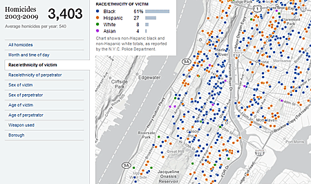
We launched our interactive homicides map for New York City today. The interactive had been in the works for a long time, but kept getting sidelined by one project or another — an overly long primary season, Olympics, the election, and so forth. Andy Lehren, a database editor at the Times, drove the data collection and reporting side of the project, while Brian Hamman and Tyson Evans hooked Andy’s data up into an updatable feed. And Matthew Bloch built the terrific map that’s the front end.

Also, in completely other topics, check out Farhana Hossain and Archie Tse’s guide to the challenges in the health care debate.

 Add comment

Where 2.0

I was in San Jose a couple weeks ago at the Where 2.0 conference, which was a blast. I gave a quick 15-minute talk on our election results maps — presentation and related links are below:

 Add comment

Mapping Olympic Medals

Back in January, I answered a number of graphics-related questions in the Talk to the Newsroom feature on nytimes.com, including one about our Map of Olympic Medals:

Q. I was very impressed by the Olympic-by-Olympic medal counts you ran during the Summer Games; the bubbles representing the biggest hauls of each Olympiad were a microcosm of 20th-century political and economic power. Can you walk us through the birth of something like this? Did someone browse through the medal counts and see trends — the rise of the U.S. and, later, China, the unnatural power of East Germany, e.g. — or is this something that becomes clear after you’ve finished the graphics?
— John Dillon

Read the rest of this entry »

 Add comment