What’s In Your Water?

water-blog

I’m way overdue in updating my blog, but thought I’d post about the latest project we launched tonight, which is a database showing the contaminants that have been tested for — and detected — in nearly every water system in the U.S.

Data comes from the Envrionmental Working Group, which collected the testing history for nearly every water system in nearly every state.

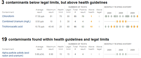
The most interesting part of the project for me, at least, was generating the timelines of the testing history for each contaminant in each water system. It was my first foray into using processing for the mass generation of charts — I ended up generating 3.2 million individual PNG files: one for each contaminant in each water system.

To speed the download time, I also used ImageMagick — another great open source tool which I’ve long been a fan of — to combine all the seperate files for a single water system into a single PNG file. Tyson Evans and Brian Hamman worked out the code use the file as a background image for each contaminant listed on the page, scrolled to show the appropriate row from the image.

Anyway, check out the full project here: http://projects.nytimes.com/toxic-waters/contaminants

(Other little bit of fun: the “N.A.” labels in the graphic are in Silkscreen, Jason Kottke’s lovely bitmapped font for small type — as a font nerd, I’ve been looking for an excuse for a while to work Silkscreen into a graphic.)
New Jersey Elections, Side by Side

nj-gov

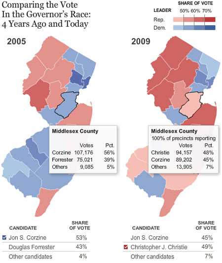
As results in the New Jersey governor’s election started rolling in tonight and I was trying to make sense of the early numbers, I kept wondering how Corzine’s performance compared to the the last election

So, Matthew Bloch did some quick hacking of his election maps, and voila, side-by-side New Jersey maps let you see the shifts in Corzine’s share of the vote. Notice in particular my home county of Middlesex, which Corzine took 56%-39% in 2005, but lost 48%-45% this year.

How Big Is That Phone?

verizon-phone-size

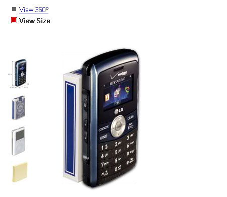
I discovered the other day that Verizon Wireless has a slick little feature on their Web site that lets you see how big its cell phones are by displaying them next to three items you may have around in your house: an iPod, a pack of playing cards and a pad of Post-It notes.

Given the varying sizes of computer monitors, it’s a smart way to let online shoppers see how well a phone will fit in their pocket or not.

You can try the interactive out yourself by going to Verizon’s page for the LG enV and clicking “View Size” at the top.

Food Rules

Michael Pollen has a fun set of 20 food rules today on nytimes.com. My 3 contributions to the cause:

1. If a restaurant doesn’t specialize in mussels, don’t order them. I’ve had mussels at far too many restaurants where they’ve clearly been around for a while or were cooked to death. Instead go to BXL (Times Square) or Monk’s (Philly) where they do them right.

2. “Truffle oil” on a menu usually indicates that cheap, artificial-tasting stuff that a chef added to make a dish look impressive, but which often overwhelms the dish, and not in a good way. (See also Frank Bruni’s lament on the same subject.)

3. Ever since I discovered that Costco sells prime rib-eye steaks for about $10 per pound, I’ve virtually stopped buying steak from the grocery store — there’s just no comparison in taste. If I’m going to consume that much fat in one meal, it’s not worth it to have a sub-par steak. (And the healthy upside, if you can call it that, to the Costco steaks: since it’s more of an ordeal to go to Costco than the grocery store, and the steaks only come in 4-packs, I end up eating steak far less frequently than before.)