We posted a number of interactives over the last week or so. The rundown:
- The Danger of Digging Deeper looks at a new process to extract geothermal energy from the earth.
- Failed Prostate Procedures at the Philadelphia V.A. accompanies a Walt Bogdanich story about botched prostate cancer procedures.
- Shan Carter and Joe Ward cranked out three interactives about the U.S. Open, this year plaed at Bethpage’s Black Course out on Long Island: The Treacherous 8th Green, The Diabolic 15th and Tiger’s Double Bogey
- Cheryl Jense, Kevin Quealy, Alicia Parlapiano and Daniel McDermon produced an informative guide to the cars and trucks that are Made in the U.S.A.
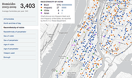
- And finally, as mentioned in the previous post, we launched our interactive map of Murders in New York.