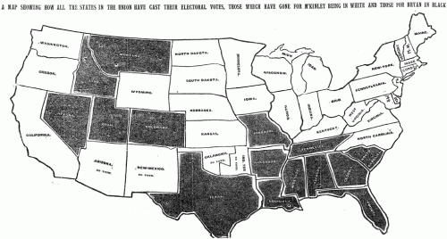
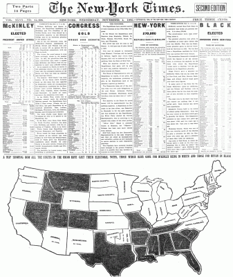
Or at least the first one published on the day after the election? A year or two ago, I went digging thru the archives to see if I could find the first election results map published in an edition of the Times dated the day after the election. This is the earliest one I found, which was published in the Wednesday, November 4, 1896 edition of the paper and headlined “A map showing how all the states in the union have cast their electoral votes, those which have gone for M’Kinley being in white and those for Bryan in black.”
The map occupied about half the front page — which also had an impressive amount of election results tables intermingled with the stories above.
The speed with which the results made it into print boggles the mind given the technology of the day (especially considering that in the last few elections in the 2000s, with all of the technology available to us, there have been a number of states that we haven’t been able to call in the Wednesday paper).
There’s more than a few things I’m not clear on — Was it a morning or afternoon edition of the paper? How did they count votes so quickly? Who compiled the results — was it The Associated Press? Does the map show the final results? The story above says that “In the East, every State from Maine to North Carolina, inclusive, has gone for McKinley and Hobart, except for Virginia, which is in doubt.” Yet on the map, there’s no indication that the status of Virginia is uncalled at that point. (And in fact, in the final electoral vote, which you can see at Dave Leip’s Atlas of Presidential Elections, you’ll notice a number of states that are incorrectly shaded in the map — Virginia, North Carolina and a handful of others in the West.)
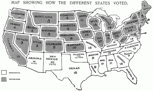
Over the next few elections, the maps grew more sophisticated. In 1904, we have hatching, an actual map key, a much less crude rendition of the U.S., and labels on the map with the number of electoral votes for each state.
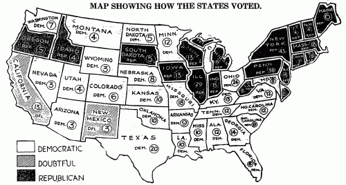
And 1916 marks the first appearance on the map of one of my favorite terms of the era: the “doubtful” states —those for which not enough results were in to call a winner — in this case, California and New Mexico with their 16 electoral votes.
They’re obviously a far cry from the interactive, updated-by-the-minute maps we publish today, but incredibly impressive for the era. It makes me wonder if the artists who produced those first maps had the same thrill at seeing the results in the next day’s newspaper that we now get from having interactive maps online and updating on election night.
(And if anyone has examples of earlier election maps from The Times or other papers, send them my way: mericson at ericson.net. Would love to add them to my collection.)


These are great; thanks for digging them up!
The exaggerated northeastern states in the 1916 map excited me briefly because my first thought was “cartogram” (this being in the very early days of cartograms). Alas it’s not that, but it’s still pretty interesting. It went from “less crude” in 1904 to deliberately simplified in 1916.
I went through all previous elections on the Times archives and it does seem that this is the first. The link to it on TimesMachine is:
http://timesmachine.nytimes.com/browser/1896/11/04/P1
Do you notice what almost all of them have in common? The south votes one way, and the rest of the country votes the other. The names of the parties have switched in modern times (1932-1968 being the period where the switch took place), but otherwise we are still fighting the war between the two “nations” welded together in 1788/1789.
Pingback: Popular on Twitter: Snarkmarket on Ambinder, Slate vs. The Observer and Collaboration at The Guardian UK » Nieman Journalism Lab
Pingback: And 36 Years Earlier … « Matthew Ericson – ericson.net
Pingback: The very first NYT election map
It seems like this is a early morning edition. In the first column of the copy, it says “Times Office, Nov. 4.—1(?) A. M.” I’m not sure what the last number is precisely, but it’s incredible how quickly the paper was ready!
Great post! Thanks for sharing this research in the archives. For me it gives a nice insight on historical perspective of all sophisticated tools we got nowadays. No new ideas behind cool stuff like Google maps, only way tools to create the ideas.
Pingback: 1001 Medios » Blog Archive » Periodismo de datos: “Everything is data”
for barth, i noticed this too, though there are waxes and wains for the border.
as a followup, is there a chart to compare if south carolina and new york / illinois have ever voted the same? just wondering
Pingback: The very first New York Times election map - Verities and Vagaries
Pingback: Yesterday’s Links | Josh Braun's Blog
Pingback: Ye olde Electoral Watering Hole!!! - Page 2 - US Message Board - Political Discussion Forum