Category Archives: Uncategorized

First NYT Election Map?

1896 Presidential Election Map

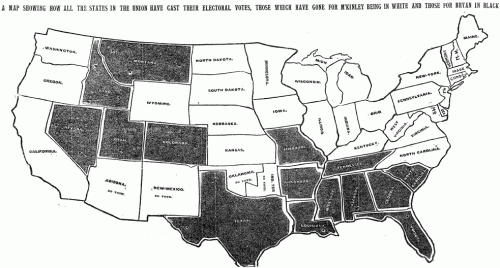
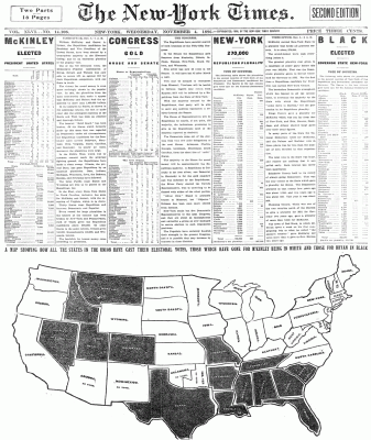
Or at least the first one published on the day after the election? A year or two ago, I went digging thru the archives to see if I could find the first election results map published in an edition of the Times dated the day after the election. This is the earliest one I found, which was published in the Wednesday, November 4, 1896 edition of the paper and headlined “A map showing how all the states in the union have cast their electoral votes, those which have gone for M’Kinley being in white and those for Bryan in black.”

The map occupied about half the front page — which also had an impressive amount of election results tables intermingled with the stories above.

The speed with which the results made it into print boggles the mind given the technology of the day (especially considering that in the last few elections in the 2000s, with all of the technology available to us, there have been a number of states that we haven’t been able to call in the Wednesday paper).

There’s more than a few things I’m not clear on — Was it a morning or afternoon edition of the paper? How did they count votes so quickly? Who compiled the results — was it The Associated Press? Does the map show the final results? The story above says that “In the East, every State from Maine to North Carolina, inclusive, has gone for McKinley and Hobart, except for Virginia, which is in doubt.” Yet on the map, there’s no indication that the status of Virginia is uncalled at that point. (And in fact, in the final electoral vote, which you can see at Dave Leip’s Atlas of Presidential Elections, you’ll notice a number of states that are incorrectly shaded in the map — Virginia, North Carolina and a handful of others in the West.)

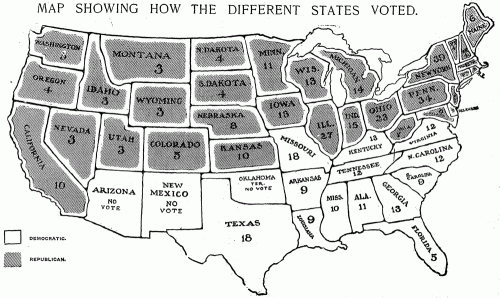
Over the next few elections, the maps grew more sophisticated. In 1904, we have hatching, an actual map key, a much less crude rendition of the U.S., and labels on the map with the number of electoral votes for each state.

1904 Presidential Election Map

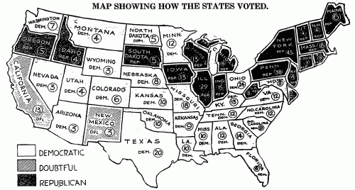
And 1916 marks the first appearance on the map of one of my favorite terms of the era: the “doubtful” states —those for which not enough results were in to call a winner — in this case, California and New Mexico with their 16 electoral votes.

1916 Presidential Election Map

They’re obviously a far cry from the interactive, updated-by-the-minute maps we publish today, but incredibly impressive for the era. It makes me wonder if the artists who produced those first maps had the same thrill at seeing the results in the next day’s newspaper that we now get from having interactive maps online and updating on election night.

(And if anyone has examples of earlier election maps from The Times or other papers, send them my way: mericson at ericson.net. Would love to add them to my collection.)
2010 Election Results

We’ve slowly started turning on some of our Election 2010 results pages for the general election in November. Right now, they’re obviously all zeros — and the interactive maps aren’t live yet either — but on election night, we’ll have a full assortment of interactive House maps, Senate maps and Governor maps, including some slick new features from Matthew Bloch. Plus, we’ll have state election result pages for every state.

Export Illustrator Layers as PNGs

Update: I’ve got a much improved version of the script that also exports artboards and adds a PDFs option. Get the improved version.

Hot on the heels of my Illustrator script to export artboards as PNG files, here’s one that exports Illustrator layers as PNG files.

To use the script, download Export-Layers-as-PNG.jsx and put in your Illustrator scripts folder (usually in Applications/Adobe Illustrator/Presets/Scripts/). Restart Illustrator, and run the script by going to “File > Scripts > Export Layers as PNG”.

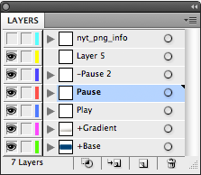
  • Files are named based on their layer name. It only exports layers where their name has been changed from the default “Layer 1”, “Layer 2”, etc.
  • If you put a plus sign (+) in front of a layer name, that layer will always be visible. Useful for if you want to have a layer that always appears in the background of each exported image.
  • If you put a minus sign (-) in front of a layer name, it will skip that layer.
  • It stores its settings in a nonvisible, nonprinting layer named “nyt_png_info”
  • It has an option for transparency, and lets you choose between PNG8 and PNG24.

You can try it out on the sample file layer-test.ai.

When you run this script on this file, it will export 2 PNGs: Play.png and Pause.png. The “+Button” and “+Gradient” layers will appear in the background of both exported files, and it will skip the “-Pause 2” and “Layer 5” layers.

twittrd.ericson.net

A year or so ago, I discovered Topsy, which lets you plug in a URL — say, for example, for a nytimes.com graphic like our Netflix map — and see how many times people have tweeted about it and what they’re saying. It’s a great service, but its one downside is that you have to search for URLs one at a time. And sometimes you want to see how a bunch of URLs are doing relative to each other.

So, I put together a little Rails app that takes a Web site — something like the NYT home page — and looks up the first 150 or so URLs that it finds on the page using the Topsy Otter API, then displays how often they have been tweeted as an overlay on the page itself.

The app is up at twittrd.ericson.net. A few things to note:

  • By default, it only looks up URLs that have a date or numeric ID in them. This is a crude way to filter down the page to just stories rather than looking up things like page nav.
  • It rewrites the URLs to point to their page on Topsy, so clicking on a link will take you to the Topsy page that shows all the tweets about that URL.
  • Depending upon a site’s HTML structure, the numeric overlays work better in some sites than others. nytimes.com looks reasonably close to real-life. msnbc.com does not.
  • The Topsy API has a limit of 10,000 URL lookups in an hour. Since it will check up to 150 links on a URL, this means that if more than 60 or so people have been to twittrd in the last hour, I might be over my Topsy API limit. Check back the next hour to see if it’s reset itself.
  • Topsy also doesn’t deal well with URLs that have the id of the story or post in the querystring, since it ignores everything after the querystring when searching. So your mileage may vary on sites with urls like post.php?id=12345.
  • And it can be a bit pokey — it hits the Topsy API for each URL it finds on the page — so it can take 20 or 30 seconds to run.

What’s In Your Water?

water-blog

I’m way overdue in updating my blog, but thought I’d post about the latest project we launched tonight, which is a database showing the contaminants that have been tested for — and detected — in nearly every water system in the U.S.

Data comes from the Envrionmental Working Group, which collected the testing history for nearly every water system in nearly every state.

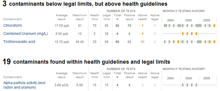
The most interesting part of the project for me, at least, was generating the timelines of the testing history for each contaminant in each water system. It was my first foray into using processing for the mass generation of charts — I ended up generating 3.2 million individual PNG files: one for each contaminant in each water system.

To speed the download time, I also used ImageMagick — another great open source tool which I’ve long been a fan of — to combine all the seperate files for a single water system into a single PNG file. Tyson Evans and Brian Hamman worked out the code use the file as a background image for each contaminant listed on the page, scrolled to show the appropriate row from the image.

Anyway, check out the full project here: http://projects.nytimes.com/toxic-waters/contaminants

(Other little bit of fun: the “N.A.” labels in the graphic are in Silkscreen, Jason Kottke’s lovely bitmapped font for small type — as a font nerd, I’ve been looking for an excuse for a while to work Silkscreen into a graphic.)