SND Winners: Updated for 2013

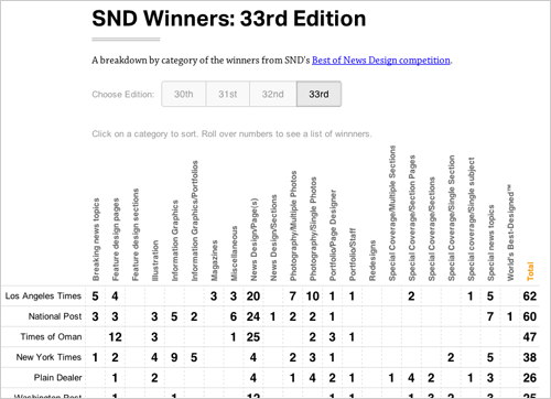
The winners of the 34th Edition of the Best of News Design contest were released today, so I’ve updated my interactive crosstab of SND winners that lets you see at a glance which publications won awards in which categories.

One particularly interesting thing to me: There were only 19 awards give in the information graphics categories — 17 for individual works and 2 for portfolios. That’s down from 97 just three years ago. I’d be curious to know how much of the decline comes from fewer print graphics being produced in general in newspapers — and probably also fewer entries in the contest — and how much is from a different, and much tougher, set of judges than in past years.
MultiExporter: Multiple Resolutions

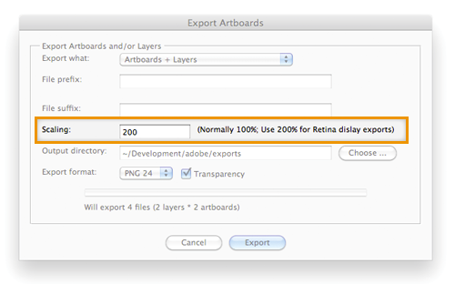
Just pushed out an update to the Adobe Illustrator MultiExporter script that lets you specify if you want to export PNGs and JPGs at a different scale factor so that you can generate versions of the images at double resolution for iPhone retina displays.

The option is set in the “Scaling” field in MultiExporter dialog box: Leave it at “100%” for  normal exports, set it to “200%” for double-resolution exports. You’ll probably also want to set a prefix or suffix or the file name, too, so that you can keep the files separated from the normal resolution ones.

I don’t think the update should have broken anything else, but let me know if you run into problems. (And to read more about how the script works, here’s more information about it.)

The script is available here — MultiExporter.jsx — and also in my Illustrator Scripts repository on github.

Who Wins at SND

The Society for News Design’s annual contest is one of the handful of design and infographic contests that we enter each year. They’ve got a database online that lets you search the winners, but while it’s great for looking up your entries to see if you’ve won, it’s a little harder to get the a sense of the big picture — for example, which papers are great at features page design, which ones excel at news page design and which ones win for their photography or information graphics.

So, I figured there must be a better way to display the data that lets get a sense of how different publications do in the different categories. So, a little bit of Ruby and Javascript later, I hacked together an interactive crosstab of SND winners. Check it out. (Modern web browsers only, please)

When Maps Shouldn’t Be Maps

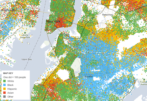
Often, when you get data that is organized by geography — say, for example, food stamp rates in every county, high school graduation rates in every state, election results in every House district, racial and ethnic distributions in each census tract — the impulse is since the data CAN be mapped, the best way to present the data MUST be a map. You plug the data into ArcView, join it up with a shapefile, export to Illustrator, clean up the styles and voilà! Instant graphic ready to be published.

And in many cases, that’s the right call.

Continue reading